

Notion
Why We Want to Turn Life into Systems
In contemporary life, individuals are surrounded by systems —
to-do lists, calendars, trackers, folders, and dashboards.
What was once designed to support thinking has gradually become something we are required to manage.
This project begins with a simple question:
Why do we feel an increasing urge to turn life into systems?

INSIGHT
The human mind was never meant to remember everything.
Modern life overwhelms people not because they lack discipline,
but because they are expected to carry, track, and manage too much at once.
Freedom today is not limited by time,
This project proposes a shift in how productivity tools are understood.
Freedom is not doing more.
It’s having less to hold.
Notion is reframed not as a productivity tool,
but as a cognitive shelter —
a place where complexity can live,
so the mind doesn’t have to.
The final visual outcome translates this idea into a spatial metaphor.
Instead of presenting interfaces or screenshots,
the image depicts cognitive load as a dense, tangled mass —
externalised and pushed away from the individual.
The framed space represents a mental shelter:
a boundary where complexity is contained,
allowing clarity to emerge not through control,
but through release.
The visual deliberately avoids interface realism,
emphasising that this is not a tool demonstration,
but a conceptual reframing of how digital systems can support thought.
Apple x Halloween
I’ve replaced the apple with a pumpkin as the logo and edited it to appear bitten, similar to the original design. Inspired by Apple’s slogan “Think Different,” I adapted it to “Dress Different” to align with Halloween, where people embrace creativity and cosplay.
This project translates Apple’s philosophy from cognition to embodiment.
Halloween is not simply a costume festival.
It is a culturally sanctioned space of transformation.
By replacing the Apple logo with a bitten pumpkin, the work performs a subtle shift:
The apple — a symbol of knowledge, rationality, and progress —
becomes a pumpkin — associated with ritual, folklore, play, and impermanence.
The iconic “bite” remains, preserving Apple’s visual DNA.
The adapted slogan Dress Different reframes difference
not as an intellectual position,
but as a physical, expressive act.


Aesop
When Luxury No Longer Needs to Be Loud
INSIGHT
Vision dominates how value is measured today.
If something cannot be seen, posted, or explained,
it is often treated as insignificant.
Yet scent is the most intimate sense we have.
It cannot be captured, archived, or optimized.
It exists only in the present moment —
and disappears the moment you try to hold it.
Luxury, once rooted in presence and ritual,
has become loud, visual, and declarative.
But what if true luxury was never meant to be seen?

Luxury is not what you show.
It’s what only you can sense.
Aesop reframes luxury through scent —
not as an object of display,
but as a private encounter.
Scent does not interrupt.
It does not demand attention.
It stays close to the body,
and belongs only to the one who experiences it.
In a world obsessed with visibility,
Aesop offers something quieter:
presence without performance.
Brand Manifesto &
PR Statement
My final visual outcome deliberately avoids product imagery, text density, or overt branding.
Instead, it presents an almost empty, atmospheric surface —
a space defined by texture, shadow, and restraint.
This absence is intentional.
Just as scent cannot be captured or displayed,
the image resists spectacle and explanation.
It asks the viewer not to look harder,
but to slow down.
The manifesto line “Presence without Performance” appears quietly,
echoing the nature of scent itself:
unassertive, intimate, and fleeting.

Yakult
Are We Really Taking Care of Ourselves?
In contemporary wellness culture, self-care is often framed as a responsibility.
We are encouraged to optimise our bodies, manage our habits, and “do the right thing” for our health.
This project begins by questioning that framework:
Are we taking care of ourselves —
or simply trying not to feel guilty?
INSIGHT
Many acts of self-care are driven by guilt, not love.
People don’t drink something healthy because they feel good,
but because they feel responsible.
Self-care often functions as a quiet apology to the body.
Brand Manifest

The final outcome takes the form of a poetic manifesto rather than an advertisement.
The blurred image resists clarity and optimisation, mirroring the emotional ambiguity of contemporary self-care.
The text unfolds slowly, resembling an internal monologue rather than a marketing message.
By avoiding product emphasis and visual sharpness, the work positions Yakult as a witness —
not a cure, not a solution, but a presence.
A six-ounce ritual that acknowledges effort, not achievement.
This project explores self-care as an emotional obligation shaped by guilt rather than self-love.
By reframing Yakult as a daily ritual instead of a health solution, the work positions care as reassurance — a gentle acknowledgement of effort in everyday life.
Rather than promising improvement, the project offers recognition.
Nike x Halloween
This project reframes Nike not as a symbol of athletic excellence,
but as a survival mechanism within a hostile environment.
The zombies represent exaggerated fears —
pressure, exhaustion, social competition —
made visible through Halloween imagery.
The runner is not a hero.
He is simply someone trying to stay ahead.
Nike shoes do not promise victory.
They promise momentum.
And sometimes, momentum is the only thing keeping you alive.

The visual adopts a deliberately graphic, almost playful Halloween style —
bright colours, simplified figures, exaggerated threat.
This contrast allows fear to be recognisable without becoming overwhelming.
The focus is not on realism,
but on emotional truth:
the sensation of being chased.

Headspace
Do We Really Need to Be Calm All the Time?
Headspace positions calmness as an accessible, daily practice within digital life.
Through guided sessions, gentle language, and structured routines, the app translates emotional wellbeing into something manageable, repeatable, and measurable.
However, as emotional regulation becomes systematised, a larger cultural question begins to surface:
Do we need to be calm all the time —
or have we simply learned to treat emotions as problems to be managed?
This project uses Headspace as a cultural lens to examine how calmness has become moralised in contemporary emotional culture.
By reframing mental health as permission rather than stability, the work challenges the expectation that wellbeing must always appear controlled, peaceful, and resolved.
INSIGHT
In contemporary society, emotions are rarely allowed to exist without explanation or correction.
They are labelled, softened, and stabilised — often in the name of wellbeing.
Modern society treats emotions as problems to be managed.
Even breakdowns are framed as failures of self-control.
Calmness, in this context, no longer functions as a temporary state.
It becomes a moral standard.

The visual language deliberately borrows from Headspace’s familiar calm aesthetic —
soft colours, gentle illustration, circular forms.
However, subtle disruptions are introduced.
The character’s expression is not fully serene.
The surrounding lines suggest emotional presence rather than containment.
Calm exists, but it is not enforced.
The poster uses Headspace’s own visual grammar to question it from within —
suggesting that calmness can be one state among many,
not an emotional obligation.

Chinese Lesson
Say It Before You Understand It
When Language Learning Starts with Curiosity, Not Courtesy
Language education is often framed as polite, correct, and formal.
Learners are taught how to greet, thank, and behave — before they are allowed to speak freely.
This project challenges that order.
Instead of starting with correctness, it begins with curiosity.
People are often most curious about the parts of a language they are told not to use.
Slang, curses, and informal expressions carry emotional power, social tension, and cultural intimacy.
Understanding these words is not about being rude.
It is about belonging.
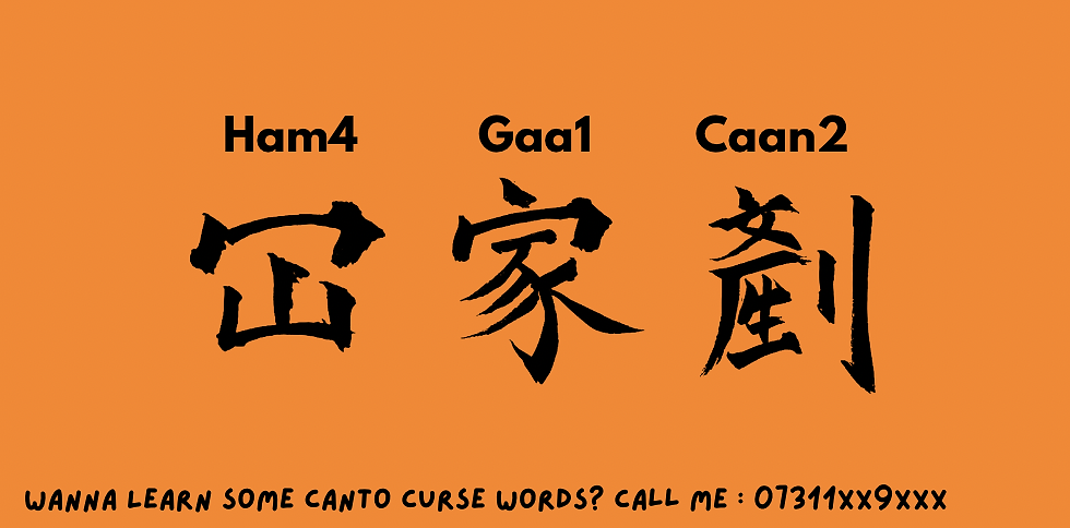
This window postcard uses a Cantonese curse word as a visual hook.
The word is not explained.
Instead, it is transliterated and categorised, treated almost like a linguistic specimen.
To understand it, one must learn the language.
The project reframes language learning not as academic achievement,
but as social access —
to humour, to intimacy, to shared reference.